Here, I've compared my magazine front cover, contents page and double page spread to existing KERRANG! ones because most of my planning and research is inspired by it.
Front Cover
I have conformed to a lot of the conventions of KERRANG! magazine. I have a masthead, main image, main feature, feature stories, skyline, footer, plug, free gifts, bar codes and price.
Masthead- I chose the name 'Night Light' because most rock gigs, concerts and events take place in the 'night' and at the gigs, concerts and events there is a lot of lighting to draw attention to the performers. The font I'ved used is an Alice and Wonderland style which is gothic looking due to the letters looking thorny and goth is another sub-genre of rock. I've placed it at the top of the page and it is placed behind the main image which is conventional.

 Main Image
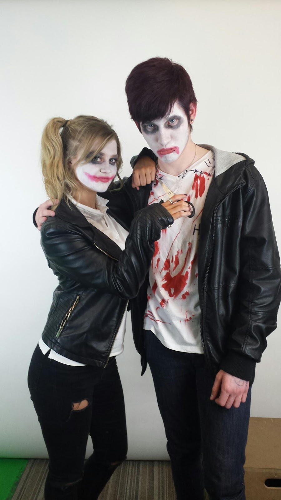
- I have used a medium, two shot of my of my fictional band,
Delirium. Becky is wearing a leather jacket, a white T-shirt and black, ripped skinny jeans. Jack is wearing a leather jacket, a ripped,white T-shirt with red patches, to look like blood to reinforce the psychotic gimmick inspired by the Joker and Harley Quinn and jeans. Both are wearing face paint similar to the Joker and Harley Quinn with the red paint applied on Becky in the shape of a smile and on Jack in the shape of a frown to represent happiness and sadness inspired by bi-polar. Becky is holding a pair of scissors motioning that she is going to cut through Jack's throat which adds emphasis to the gimmick.
Main Feature- The main feature consists of "Delirium" which is the name of the band and "We're just a bit crazy!" Which is a pull quote from the main feature. The "Delirium" is in an 'erroded' style font from dafont.com. I chose this because it looks rugged and quite messy which conforms to rock stereotypes. The pull quote I've done a contrasting red and white effect over the black and white costume. Where the costume is white, the letters are red and where the costume is black, the letters are white. I did this because the main colours are black, white and red but the costume is mainly black and white, it stands out well and it looks pretty cool.
Other Features- I firstly did the feature stories with the images (David Bowie, Garrod and All Time Blows), but it still seemed too empty when I finished the second draft therefore I added some more feature stories (without images) to fill in the spaces and to make the magazine look like there is a lot going on with headings in the 'Alice in Wonderland' font like the masthead, but in lower case. I have it like this because I liked how NME has their feature stories.
Skyline- I changed the skyline to different offers so it suits my target audience and also the last skyline "FRESH NEW MUSIC!" sounded like something you'd see on a pop magazine.
Footer- The footer simply has a list of of artists featured in the magazine.
Plug- The plug has a competition in it which is conventional.
Free Gifts- I've added free gifts which is what my audience want as seen in my research and audience survey.
Barcode, date, price etc. These are conventional to nearly all magazine.
Contents Page
Masthead- I've added the masthead to help get the name fixed into my audiences' mind.
Main Image- I've added a main image because that's the main feature of the magazine. It's of Becky and Jack sat in different poses but it still follows the house style because its the same mise-en-scéne.
Contents- This is the 'Contents Page' so obviously I need to have contents therefore I have followed conventions.
Page Title- I have added a title of 'Contents' to allow the audience to know that it is in fact, the contents page, if they can't tell its the contents
Editor's Letter- KERRANG! uses an editor's letter on their contents page which I really like because it allows the audience to connect with the institution therefore I used the idea.
Subscription Box- Most magazines have a subscription box or a details box which allows audiences to communicate with the institution because it consists of social media details, contacts details and website details as well as subscription offers. This is a good for the audiences because it creates a connection between the audience and the institution.
Double Page Spread
Main Feature Title/Pull Quote- I chose the pull quote, "we're just a bit crazy!" because I feel as though it best describes the band with the Joker and Harley Quinn inspired gimmick. I've done it in the 'eroded' font from the Front Cover ('Delirium'). I think having pull quotes as titles in magazines is good because it gives the audience a slight glimpse at what the article is about and can be quite enticing.
Main Image- Pretty much the same stuff as the other 'main image' analysis as before.
Text Arranged into Columns- I have arranged the text into columns because it is conventional in most music magazines and it makes it easier for audiences to read the text. I chose red text because it links with the rest of my magazine with the colour scheme. The font I have used is 'Century Gothic' which doesn't seem too boring but it's readable.
Drop Cap- A drop cap is another convention for a magazine double page spread. It draws in the attention of the audience because its at the beginning of the story and the letter is a lot bigger than than the rest of the text.
Page Title- I made the page title 'EXCLUSIVE' in an eroded font because I think it would be better if it seemed like this was an original interview and the font is the same as the title page which links the two like a house style.
Stand First- A Stand First is used to start the story off, like an introduction, it sets the scene.
Page Number- Page numbers allow the audience to locate a specific section they desire to read and these numbers used in the contents page which makes it quick and easy to locate.
I have challenged conventions in the front cover by adding more photographs for my feature stories which is a visually a good way of showing off the magazine. Also it makes the magazine look busy like a a rock magazine. I've also used language that my target audience (aged 25-24) would appreciate like "Badass". It allows the institution to connect with their audience if they get on their level.
I have challenged conventions in the contents page by showing the audience some offers which is enticing. From my audience survey, I know that my audience like offers and free gifts like. Free gifts include a Night Light T-shirt in the following month's issue, three posters and a £10 iTunes voucher.
I have challenged conventions in the double page spread by adding additional images from the recording studio and behind the scenes of the photo shoot. This allows the audience to feel like they were behind the scenes too. I have also added an image of the album cover which is a good way to promote Delirium's new music.


