AS Media Foundation Portfolio
Wednesday, 9 March 2016
5. How did you attract/address your audience?
These are the questions that I will ask my audience
- What genre do you think my magazine is?
- What type of audience do you think this magazine is aimed at (age/social group/gender)?
- What do you like about my music magazine?
- Would you change my magazine? If yes, how?
- What would you rate my magazine from 1-10? (1 being bad, 10 being good)
Judging by the answers I received, my magazine was easy to identify as a rock magazine. The ways in which I have made it a rock magazine is that my main image artists have a Gothic look about them as the characters they are inspired by are villains and are quite dark. I have also mentioned many rock artists such as Paramore, Disturbed and Marilyn Manson.
The answers given about the target age group, seemed as though they had the right idea, The age group I was going for was 15-24. I have included free gifts which would entice a younger audience as they would be drawn to the gifts because they come free if the magazine is bought so they pay for the magazine which is only £2.00 and they get something nice with it. They get 3 posters, £10 iTunes gift card and in the next month they can get a free T-shirt also I have included a plug which gives my audience a chance to win a £250 Asylum Industries voucher and a competition to win Leeds Fest.
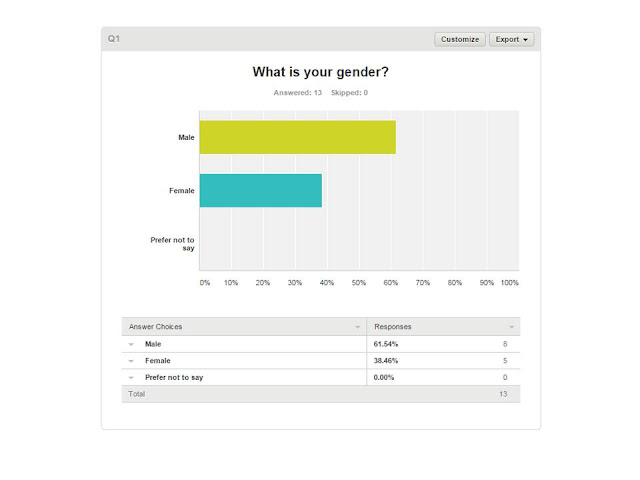
I don't think I have presented the gender audience very well as most of the answers given are "male". One person thought mixed. Maybe I should have included more female artists because the images I have used, only 2 are female and 5 males and I have mentioned Paramore who have a lead female, Hayley Williams. All the other artists mentioned are male which could have given off the idea that my magazine is more male orientated. Some of them have mentioned working class who my magazine is aimed at due it being affordable by many.
The images I took were liked by the people above. This could be down to either mise-en-scéne or the quallity or both. I have been very creative with the mise-en-scéne because I used face paint for my artists gimmick and I tried to do a David Bowie impersonation/tribute which I thought fans would like as he was an iconic artist. The images are of good quality as you can see the details clearly of the artists. I used my mobile phone camera (Samsung Galaxy S4) to do this as I had used a Canon Camera before but the quality didn't appear as great. Also the colour scheme of red, white and black was liked because they work well with each other as the text is readable and the dark, maroon type of red, like blood which reinforces the violent rock stereotype.
If I had more time to improve my product, I would work on making my magazine more gender neutral as I think male artists dominate it because I want my magazine to be open to a wider audience and not just one gender. Other suggestions include changing the footer as it stands out too much and goes against the house style and maybe to include less free gifts because a real institution would have to spend more money on making these free gifts available.
The average score my magazine was given was 8/10 which I am happy with as it is still a high score and there is still some more room for improvement.
4. Who would be the audience for your media product?
A lot of my decisions on who my target audience would be were based on the social demographic table and the results of my audience survey I conducted several months ago.
3. What kind of media institution might distribute your media product and why?
This is what my magazine would look like on an iPhone which is one of the ways I want my magazine to be distributed because of the proliferation of smart phones.
This would be a good way to advertise my product as a lot of people within my target audience especially aged 15 and 16, use buses because they are under the age for the required for driving lessons. Also a reason why younger people don't drive is because the insurance cost is much more as younger people are more likely to cause or be involved in an accident therefore, bus stop advertisements would be a good way to entice the audience.
I'd like my magazine to be distributed to small news agents, convenience stores and the smaller versions of big supermarkets like Tesco Express, Sainsbury's Local and Cooperative because they are small, you're more likely to walk past the magazine section. Due to the size of supermarkets and people mainly going there to do big shopping for their homes, I think it would be less likely that my magazine would catch the eye of a customer so I think smaller shops are best.
Subscribe to:
Comments (Atom)


